
Refreshing the Netflix web app.
In an effort to improve and keep my design skills fresh, I decided to give the Netflix web app a refresh.
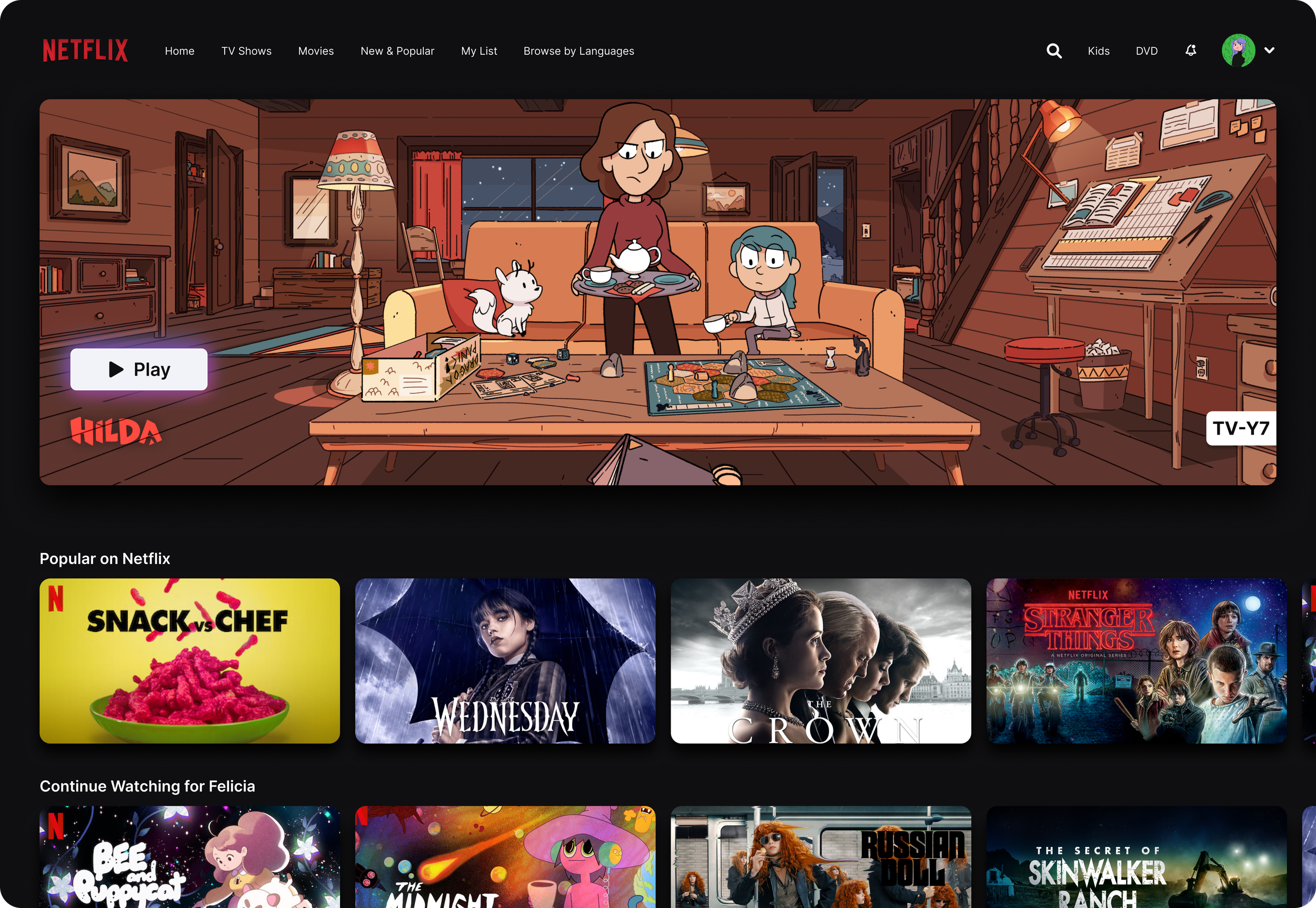
UX Issues
The current landing page is a bit overwhelming.
There’s no one place for my eye to land when scrolling through the list of video options.
There’s very little space between each ‘card’ giving the impression of each image running together, which creates visual chaos.
The navigation integrated into the hero video at the top of the page combined with the 12pt font made it easy to overlook and potentially difficult to see.
UI solutions
I separated the navigation from the hero image, removing the contrast issues.
Increased navigation font from 12pt to 14pt
Reduced the size of the hero video to provide more visual balance. This would likely decrease load times for those on slower internet connections.
Provided some depth to the video cards by adding a drop shadow.
Gave the cards more definition and room to breathe so your eye naturally progresses from one end of the screen to the other.
Brightened up the background slightly to help with contrast and visibility.
